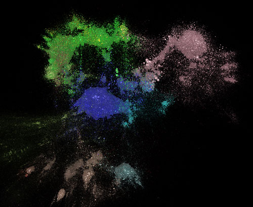
Visualizing the interactive arXiv landscape. (Courtesy: Damien George, Rob Knegjens)
By Matthew Chalmers
With almost a million articles accrued over the past two decades, the arXiv preprint server has become an indispensable tool for physicists.
Now, thanks to a website called Paperscape developed by theoretical physicists Damien George at the University of Cambridge in the UK and Rob Knegjens at Nikhef in the Netherlands, its vast content can be visualized in all its glory.
The interactive graphic is based on a nifty algorithm that groups arXiv papers that cite each other together, as if they were linked by invisible springs, but forces those that don’t to repel each other. The resulting map resembles an irregularly shaped galaxy in which each “star” is a scientific paper, revealing how the various categories of research (shown in different colours) relate to each other.
At its centre, demonstrating its importance across different physics sub-fields, is a Switzerland-shaped blob representing theoretical high-energy physics, while on the map’s outskirts are fields that have weaker links to other disciplines. The radius of each point indicates how many times the paper has been cited, allowing users to quickly assess what the most important papers in different fields are, while the brightness of a point indicates how recently the paper was published.
The purpose of the project was to make the arXiv less overwhelming, explains George. “We all use the arXiv every day and watch this long list of papers go past our eyes, so it was interesting to see what its structure is,” he told physicsworld.com.
The main feature that stands out is that there are well-defined “continents” corresponding to broad areas of research, George explains. But more interesting are the interfaces and connections between these areas – for example the overlap that cosmology has with particle physics and astrophysics. “The map is telling us what papers we need to read to understand such cross-disciplinary work,” he says.
It took more than a year of evenings and weekends to complete the project. “There’s a lot more information we can add, so it will be interesting to see the reaction of the physics community,” says George.
An important step in the gut theories is to visualize our production on a superfine network. Congrats to the researchers.
Good work. I was surprised at how HEP utterly dominates, and how small say CMP was. IMHO there’s loads of guys out there doing good work, but all too often all the public gets to hear about is “useless hypothetical junk peddled by pushers”. But anyway, like I said, good work.
Looks like a piece of art by Kirkegard .
Trackback: A Map of the Research Literature | Sean Carroll
Sean Carroll pointed out that the HEP domination was because HEP started using arXiv first. See <a http://arxiv.org/help/stats/2012_by_area/index for submission volumes by field.
Making the arXiv more visible and more easily accessible is a helpful step.
Trackback: Forskere har laget en hel galakse av kunnskap | Kollokvium
Excellent, elegant concept. I love the application of particle attraction/repulsion to something as mundane as the organization of documents. This is Knowledge Management at its finest – deliver the information in a way that is intuitive to the recipients. Bravo!
It is going to help fresh research fellows.
Thanks for finally writing about >Blog – physicsworld.com <Loved it!
I couldnt resist commenting. Well written!
Decidió convertirse en solista tan pronto
como editó sus primeros discos, incluyendo su álbum debut The World of David Bowie.