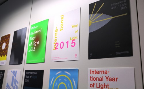
IYL 2015 is the theme of this student poster project.
By James Dacey
One of the big aims of the International Year of Light (IYL 2015) is to take scientific ideas out of the lab to show the world just how inspiring and useful they can be. In the process, it can forge relationships between different communities, including scientists, engineers, artists, journalists, architects, politicians, aid workers…the list goes on.
Here in Bristol, where Physics World is produced, we’ve seen a fantastic local example of this by way of an art project at the University of the West of England (UWE). Second-year graphic-design students were set the brief of creating posters themed on IYL 2015. Last night we hosted an evening at IOP Publishing headquarters to showcase the students’ work and to let them find out more about science publishing.
“The students were truly engaged with the subject matter and that’s when we always see the best results,” says Gabriel Solomons, the graphic-design tutor at UWE. Solomons says the theme of this second-year project is always inspired by major national or international events such as the 2012 London Olympics and last year’s First World War commemorations.
The students’ brief was to design a poster rooted in the traditions of International Typographic Style. It’s a style that was developed in Switzerland in the 1950s that emphasizes neutrality and harmony through a grid layout with clean sans serif typefaces where the text often becomes a key element of the design. Students were told to play with no more than two colours and then personally screen-print their creations.
So what did these budding designers come up with?
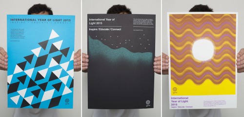
One of the things I really liked about the poster collection is that the students interpreted the brief in starkly different ways. Art is a pretty subjective affair but I’ve picked out three of the posters I particularly liked. Click on the image to see a larger version.
The creation from Mohammad Arfa (left) reminded me of a shoal of fish, but he told me that he was inspired by seeing light reflect off the water near his house by the Bristol docks. Arfa said he thrived on the fact that students were given just a single day to work on their designs. “I had my idea and didn’t overthink it,” he says.
The earthy tones and psychedelic swirls give the poster on the right something of a 1970s vibe. Its creator, Parvin Sephr, says her design represents the wave–particle duality of light, a concept she was unfamiliar with before this project. She says that she wanted to steer clear of clichéd imagery such as suns and light bulbs.
Elliott Harding had looked for inspiration on the IYL 2015 website before coming up with this constellation and curtain of jade light (middle). To my eyes, he’s done a stellar job at achieving harmony in his composition (if you’ll excuse the pun). Elliot emphasized that artists can benefit from not getting too bogged down in the technical details of science, instead focusing on the core themes and imagery.
You can see close-ups of all the posters in this image gallery.
Find out more about IYL 2015 via its website. Likewise, take a look at our free-to-read digital collection of 10 of the best Physics World features related to the science and technology of light, spanning everything from the physics of rainbows to a new type of glasses that could bring improved vision to millions. Finally, you might like to check out this short film about how new light-pollution laws in New York State are allowing amateur astronomers to reclaim the night sky, part of a series of short films we are commissioning for IYL 2015. There are more films from that series coming to physicsworld.com soon.

Guidelines
Show/hide formatting guidelines
this text was deletedwhere people live in harmony with nature and animals</q>
Some text